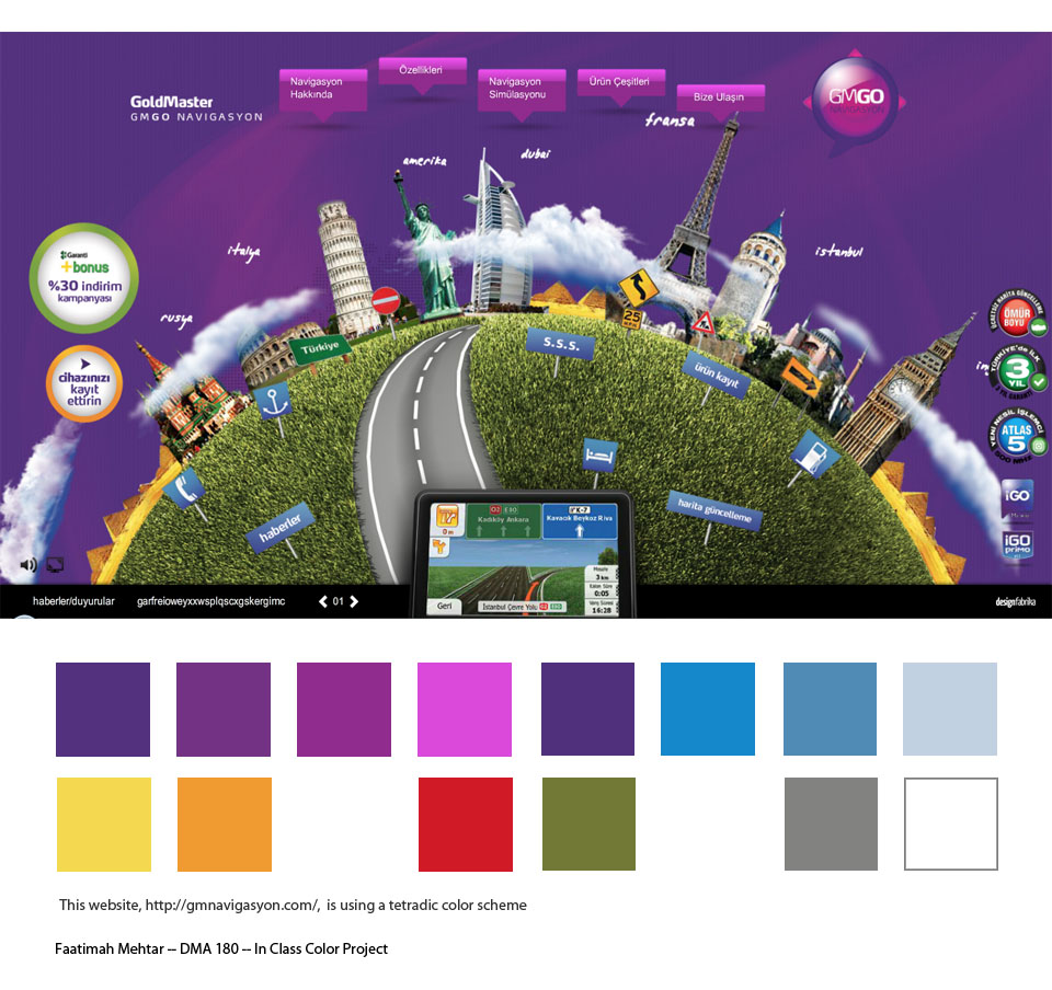
The point of this project was to take the site I selected for color analysis (shown at bottom)and
redesign it's home page.
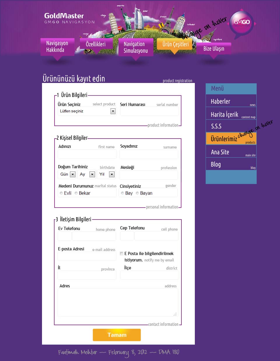
Since the only thing I could do to this particular site's home page was break it, I opted to redesign one of it's inner pages,
which happens to be a Product Registration page. I noticed that the site's navigation menus were inconsistent and
incomplete, so this is what I would do to complete it:
- Add a banner to the inner pages that ties into the beautiful graphic on the home page, and the Blog page
- Add a top navigation menu that replicates what is on the home page
- Add a menu to the right, which is on some pages, but not all
- Pull the colors of the home page into the inner pages, via that left menu
- Add subtle English hints to the Turkish Menus
- The form below looked like a wall of fields; I decided to break it down into manageable sections, to not scare users away
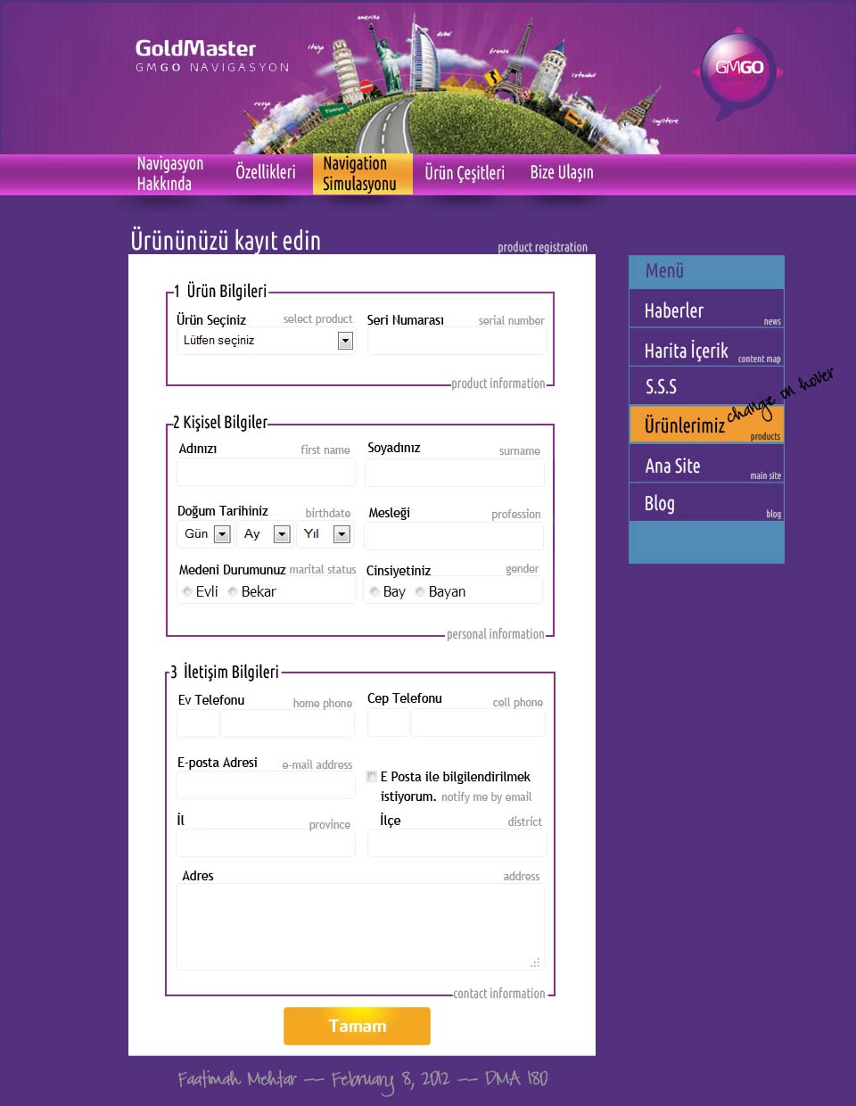
The following features a more traditional navigation bar for the top of the page:
The following is the original home which is impossible for me to improve upon: